
Not long ago, I spent almost an entire day formatting - then reformatting - an internal management report that I hated.
It wasn't a problem with the numbers or other data in the report. It was how it looked. There was no clear thought put into to user experience (UX) design, no thought to aesthetics or anything of that nature. It was ugly - and probably not far off the reports that come out of too many finance departments.
 Of course, the main purpose of any financial report lies in its ability is to convey insights that drive company action. To the best finance professionals, the numbers should paint a picture, tell a story. A good example comes in Shoe Dog, a memoir by Nike Inc. founder Phil Knight, who recalls his early days as an accountant at Price Waterhouse and a manager with a gift for analytics:
"In a column of otherwise spectacular fours and nines and twos, he could discern the raw elements of Beauty. He looked at numbers the way the poet looks at clouds, the way a geologist looks at rocks. He could draw from them rhapsodic song, demotic truths. Day after day I watched Hayes do something I'd never thought possible: He made accounting an art."
There's just one problem: it's no longer just accountants who have to look closely at those reports. Transformative CFOs work hard to not only distill information but to collaborate with a wide range of planning stakeholders across the organization. That means they have to make sure the full story behind the data is reflected in the beauty of their presentation - everything from annual reports to monthly management updates.
In The Importance of Data Visualization in FP&A, Innovation Enterprise editor James Ovenden gave a good business case for why this is so important:
"Visualization reveals intricate structures in data that cannot be absorbed in any other way, and storytelling with data visualization draws an impactful response from the user and reinforces it with numerical evidence," he said. "It means that problems can be spotted faster, and solutions implemented as early as possible. Data visualization also means that you have one central source of truth for information that can be viewed across the entire organization, with all employees able to interrogate and interact with the data."
This doesn't have to be a painful or laborious process at all, but it does require consideration, planning and the right reporting tools. These are a few of the ways I'd recommend to make beauty a standard requirement in your reporting:
Finance departments have traditionally focused on the accuracy of the numbers and KPIs in their reports, not on their beauty. Sharing numbers you can trust is still Job Number 1, but transformative CFOs and their teams also take the time to imagine what CEOs and other executives do with those reports.
Do you want your report to:
Some financial reporting may include these elements and more, but you get the point. Much as you would choose your wardrobe carefully when you're getting ready to present to your board, beautifying financial reporting starts by knowing exactly what kind of impression you want to make, what kind of story you want to tell.
Unlike an artist starting with a blank canvas, CFOs and their teams don't have to create each report from scratch. There are countless examples online that can offer inspiration, ideas and best practices you can start using for your reporting today.
This post from Column Five Media for example, offers a curated selection of 40 different companies' annual reports, showcasing an arresting use of colors, photography and other elements. Their conclusion?
"Regardless of your brand, product, or service, your annual report is always an opportunity to engage and connect with your audience, whether it's stakeholders, employees, or customers. Look for opportunities to showcase great design at every touchpoint, and you'll keep your audience's attention," the authors said.
Of course, annual reports may get more attention from marketing departments and design agencies than the everyday reporting the finance team does, but the same principles hold true. For some other great examples, check out this post from Forbes featuring more numbers-oriented reports from Shopify, Mailchimp, Kickstarter and more.
CGMA Magazine and KMPG recently worked together on a primer about financial reporting design that suggested exploring all the possible approaches to tell a story with numbers before the storytelling actually begins.
 If you know what you want the numbers to convey and the audience you're going to reach, there are plenty of ways to make the data more dynamic. Knowing the story you want the numbers to tell will help you determine the best way to present them.
"Options include dashboards, line charts, mapping charts, and bar or pie charts. Bridges, also known as waterfall charts, are well-suited to depict variance analysis as the steps in the bridge are to scale, so the viewer's eye is naturally drawn to the most significant movements first," the article said.
"The positioning, colors, and scaling of the visualization tool you choose are important aspects. Opt for clean, sharp contrasting colors. Place your key message in the top left-hand corner of the page or screen, as this is the area the reader notices first."
Of course, reports may not merely be printed but viewed on laptops, tablets or even smartphones, all of which have their own design possibilities - and constraints - you need to take into account.
The only complaint you're likely to hear more than a report being too long or dull is one that's too busy. Overloading reports is easy to do when you're trying to offer a rich, informative design experience, and trying to tell the full story behind your numbers.
Upslide, a company which offers tools to make charts within Excel, offers some great tips in an article on its blog. It's worth looking at how they discuss these best practices in detail, but some of the pointers include:
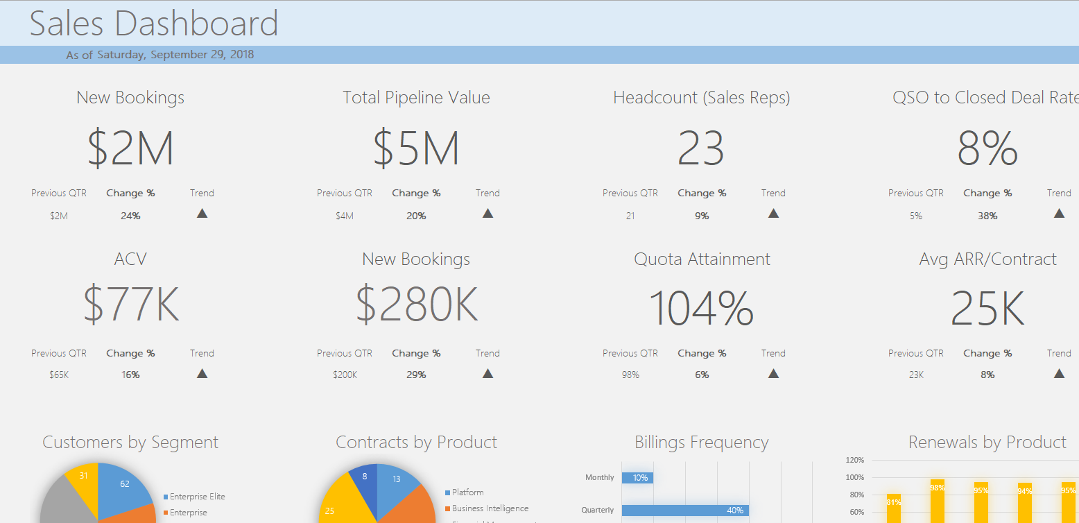
This may sound obvious, but standardized financial statements and old habits make it easy to overlook. Based on your experience interacting with your CEO, executive or board, what are the most common questions you're likely to get when you deliver a report? Do they want to know your performance compared to forecast? Or who the top (and bottom) performing sales reps are?
Anticipate these questions and design your reports accordingly. Make effective use of bubbles, colors or other design elements to proactively drive your audience towards the details they'll want to see first.
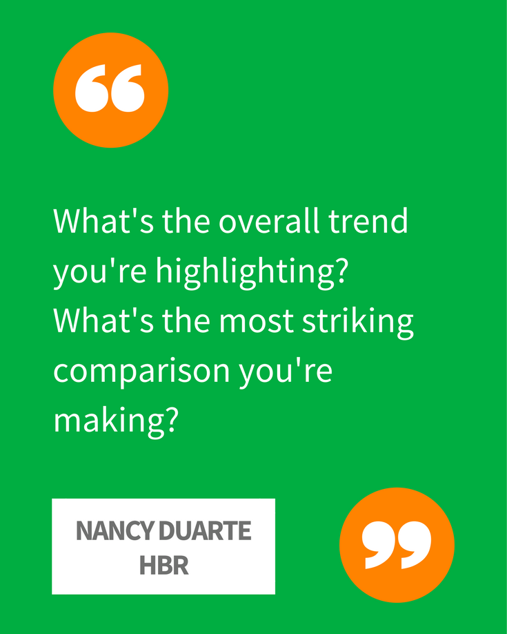
In an article in the Harvard Business Review author Nancy Duarte helps build on this theme:
"When delivering a presentation, show the conclusions you've drawn, not all the details that led you to those conclusions," she writes. "People won't have time to chew on a lot of complex information, and they're not likely to run up to the wall for a closer look at the numbers. So, think in broad strokes when you're putting your charts together: What's the overall trend you're highlighting? What's the most striking comparison you're making? Those are the sorts of questions to answer with projected data."
Financial reporting should never exist in a vacuum. It should be developed with an eye towards metrics and KPIs that tell the full story and drive decisions that affect your entire organization. An article on TechTarget shows how data visualization can bring disparate sources together to find new meaning, like combining operational data from a call center with traditional financial reporting data:
A company can drill down into one of those categories - using any number of graphical representations, including geographical maps, heat maps, paths and scatter graphs - to gather information that will help their leaders make decisions. Do they need to allocate resources differently? Do they need to establish a cost-cutting initiative or a productivity initiative?
You know how major movie studios will hold advance screenings to gather feedback from audiences long before an official release? They understand the importance of making sure people will connect with and respond to what's being shown up on the screen. It should be no different for finance professionals.
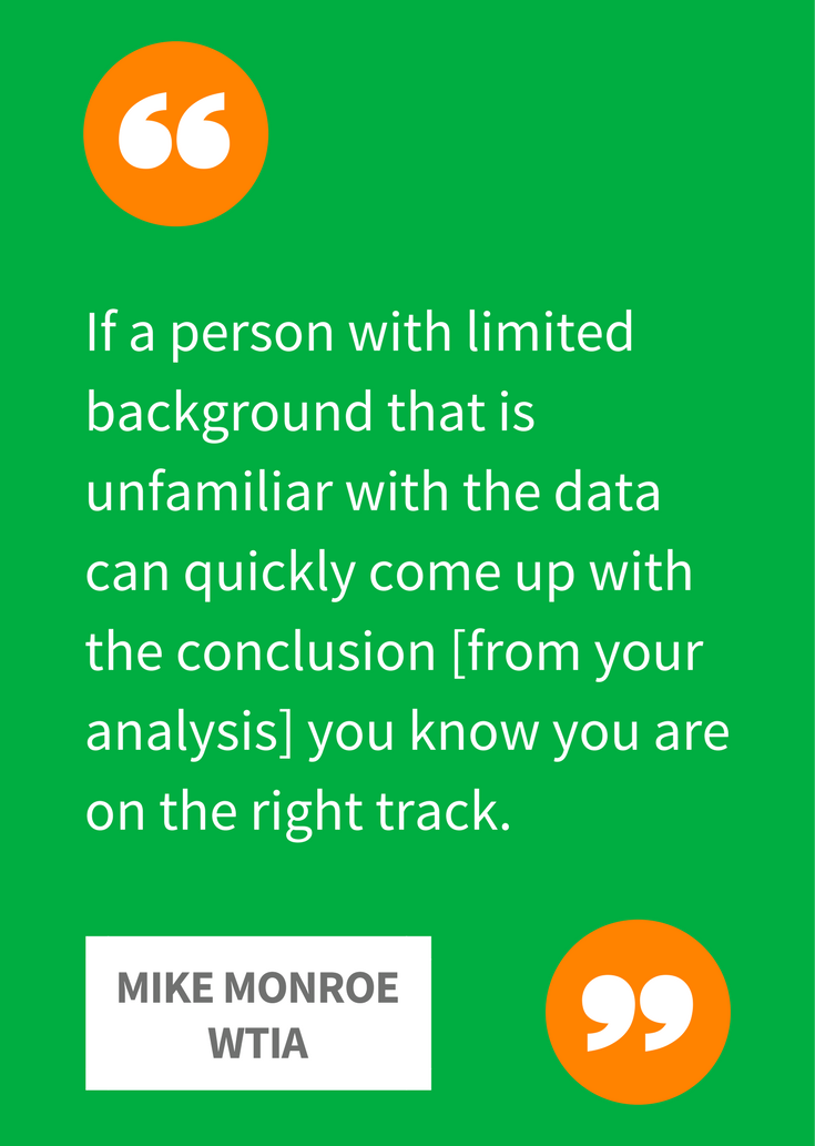
As Mike Monroe suggested on the Washington Technology Industry Association blog, there is usually at least one or two people in the organization who could be a bellwether for how a report will go over with others:
I highly recommend peer or "lowest common dominator" data reviews prior to release. If a person with limited background that is unfamiliar with the data can quickly come up with the message/conclusion from review of the analysis, then you know you are on the right track. Conversely, if the reviewer gets confused, overwhelmed or has the wrong takeaway, you will likely have to rethink your work.
It might be good to turn to someone outside of finance for something like this - it could be a coworker or peer in sales, marketing or even IT. Over time, you'll begin to learn from them what works and what doesn't.
Yes, a picture is worth a thousand words, but beautiful financial reporting is even more valuable when it provides guidance - predictive and prescriptive - on the future of your organization and how to get there. Numerous technologies exist to improve the way finance departments not only crunch the numbers and make sense of them, but what they say about the future of your business.
This article on Accounting Today argues that data visualization is critical for areas like internal audit, but not without better analytics under the hood. It quotes research from Deloitte where 86 percent of the chief audit executives said they use analytics but only 24 percent employ analytics at an intermediate level and seven percent at an advanced level.
In short, it's still early days for predictive analytics in financial reporting, but that presents a great opportunity for you to be an analytics pioneer in your organization - if not setting standards for your industry.
I remember a manufacturing client where the CFO loved the reports we developed. He said he believed the numbers were accurate in part because of the way the report was formatted.
Think about that for a second. For at least some of your audience, the look and feel, the formatting and indeed the beauty of your reports will have a direct impact on how much they trust the numbers within.
Every report recipient will have a different way of how they want to ingest information, but they'll always appreciate an effort to make the experience easier, more engaging and memorable. Some will only want to see the big picture and high-level takeaways. Others will want to drill down much deeper into cause/effect and correlations with a variety of other factors.
 Along with building their analytical capabilities, the quest to improve the visualization and presentation of data may wind up influencing the kind of skills for which transformative CFOs want to hire, and the way they develop their own talents.
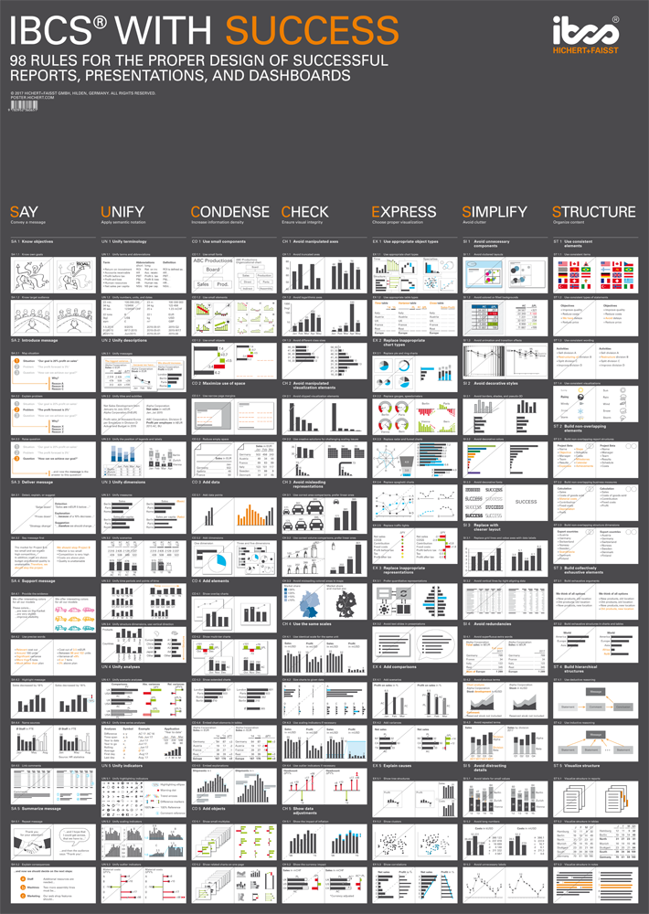
On CPA Now, self-confessed "numbers nerd" Timothy Dinan talks about how he turned to the International Business Communications Standard to learn seven rules for conveying complex ideas through visualization. The concepts include "say, unify, condense, check, express, simplify and structure." In other words, SUCCESS.
"I believe the CPA profession, for whatever reason, has a tendency to drop the ball when it comes to the communication aspect of the data," he writes. "The inclination is to just send the data and assume the reader will understand it. This is a terrible assumption."
Your audience may never say thank you for a beautiful financial report. But if you do it right, they'll almost certainly consider the work you and your team do as more important, more influential and worth more attention. For anyone striving to become a transformative CFO, that could be the most beautiful thing of all.
Evan Webster is an experienced sales professional and storyteller with a passion for innovative technology. He currently serves as a Senior Area Sales Manager at Vena and previously worked as a Content Specialist. He continually strives to inspire finance professionals to become strategic business partners and is dedicated to helping them automate and streamline their planning processes so they can make better decisions with reliable, data-driven insights—enabling meaningful growth for organizations across the globe.

